Building Design Systems
Creating a comprehensive design system to standardize visual identity and design components across ACM websites.

Scope: Tokens, components, and documentation · Web & Mobile · Light & Dark Mode
Overview
ACM is UCSD's largest programming student organization, with over 500 members. The ACM Design System is a token-based design language built to unify the visual experience across all ACM club websites. It covers color primitives, semantic design tokens, a modular type scale, elevation layers, and fully documented interaction states. I primarily worked on creating reusable components, or "molecules" that followed our guidelines for designers to use.
Before this system existed, every club project started from scratch. Designers rebuilt the same buttons, color palettes, and type styles from memory. Developers hand-coded every UI element independently. Every website looked and felt different, and an enormous amount of time was wasted on work that had already been done before.
The Problem

No shared foundation
ACM has many sub-groups, each with their own website. Without a shared design language or component library, every new project was its own island. There was no agreed-upon color, no standard type scale, and no documented component behavior.
Designers were rebuilding from zero on every project
Every new club site required making the same decisions from scratch: How much spacing should we use? What does a button look like on hover? What should the menu component look like and what should it look like on desktop vs mobile? This kind of maintenance consumed hours on every project with no carryover to the next.
There was no standardized practices for typical, granular design decisions and no standardized reusable components. Styles were copied and pasted at best, recreated from memory at worst. Minor differences accumulated across files until projects looked like they came from a different team.
Developers were manually coding every component
Without a component library, developers built UI elements from scratch for each club site. The same button, the same card, the same navigation pattern, coded independently by different people. CSS was duplicated, markup was inconsistent, and there was no documentation to reference when a new developer joined. The result was slow builds, inconsistent behavior, and a codebase that was expensive to maintain.
Inspiration & Research - Learning from the Best


Rather than inventing new patterns, this system studied industry renown design systems to understand what works and why. Two systems shaped the approach most directly.
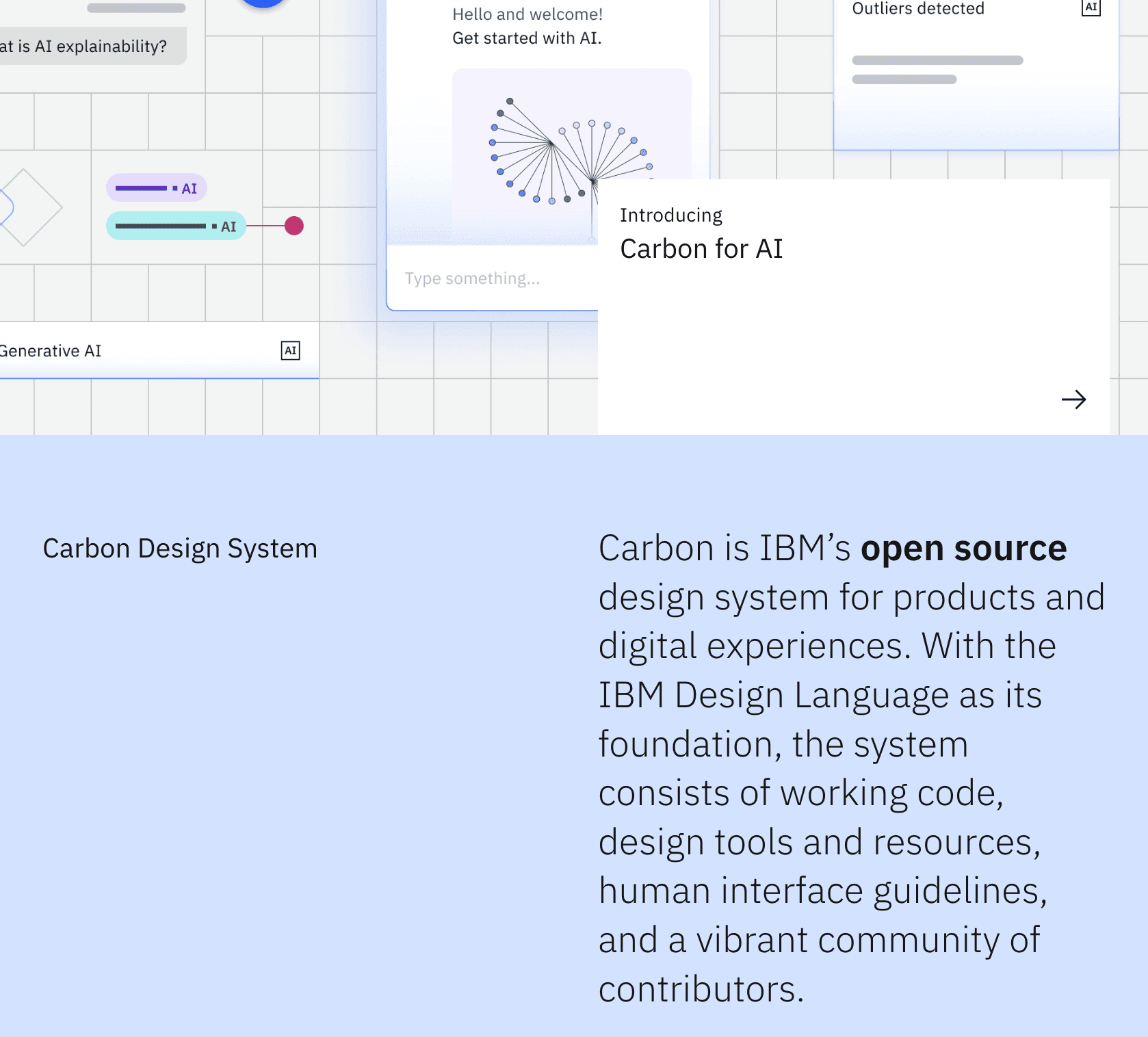
Carbon Design System

Token Architecture
The system is built on Figma Variables with two layers. No component layer holds a hardcoded hex value.
Primitives

Semantic Variables

Color System

Typography


Surface and Elevation

Components
I mainly worked on the components within the design system. Every component in the library was built from scratch. Each one references semantic tokens throughout, meaning no component contains a hardcoded color, spacing, or type value. All interactive components are documented across the same five states: Default, Hover, Focused, Active, and Disabled.
Buttons


Pagination


Tables


Accordians

